There is a large selection of Squarespace templates that could serve as a solid foundation for a church website; however, certain ones will require more modification than others.
The appropriate template ought to come equipped with necessary components such as an address and location section (complete with a map), prominent contact information, a service schedule, and plenty of space for large photographs.
Despite the fact that Squarespace does not offer any templates that were developed expressly for churches, a few of its designs include all of those features and more.
There are many templates available for the category “Community & Nonprofits,” and several of them work really well. Additionally, there are some options that are surprisingly good in other categories as well.
After researching and analyzing a large number of Squarespace templates, I was able to identify the ones that work best for churches, so let’s begin.
8 Best Squarespace Templates For Churches 2026
A good place to start is Community & Nonprofits.
In the Community & Nonprofits category, you will find a couple of templates that are suitable for churches, but there are many more options available. There are some great options hidden in unexpected places!
Here are my favorites.
1. Lusaka – Share Your Mission
You are able to incorporate content from other pages onto the homepage of your website using Lusaka.
Lusaka is a straightforward template that enables you to concentrate on communicating the primary purpose of your church.
You could talk about the volunteer work you do in the community or with charitable organizations, or you could discuss the characteristics of your church that make it truly stand out from others.

Using a combination of photos and links, this template gives you the ability to include excerpts from each page right on the homepage of your website.
The Donation button that is located in the navigation bar and the contact form that is located at the bottom of the homepage allow visitors to get in touch with the organization. These are two of the features that I appreciate the most.
2. Eldridge – Focus on Your Atmosphere
It is simple and straightforward.
It’s possible that Eldridge was designed specifically for a restaurant, but with a few minor adjustments, it could be the ideal setting for a church.
The home page is very simple to read and includes a menu section that, along with the large image that it features, is very simple to modify so that it displays the hours that you are open for business.
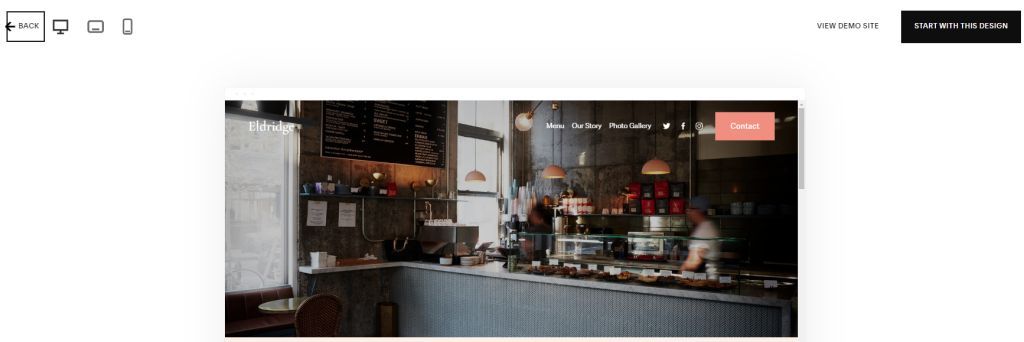
On the Story and Photo Gallery pages of your website, you have the ability to display large photos of your congregation participating in various activities so that site visitors can get a sense of what your services are like.
Eldridge exudes an air of serenity and tranquility, thanks to its light and creamy color palette, and the font that is used by default is also quite elegant.
3. Colima – For Churches With Lots of Events on Schedule
Because Colima was developed for the purpose of offering classes, it possesses a significantly higher level of functionality than that of a standard landing page.
The template would be useful for churches that host a variety of events, such as prayer groups, bible studies, and food drives.
If you want to be extremely organized, you can give each get-together its own unique web page, and you can even require visitors to sign up for individual functions (this is one of my favorite features!).
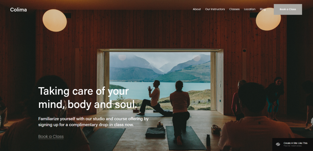
The remaining pages of this template can also be helpful for churches in various ways.
The page titled “Our Instructors” could be easily converted into a page titled “Our Pastors,” and the page titled “Blog,” which is fully functional, would be ideal for publishing your most recent sermons or other church announcements.
Visitors will be able to locate you easily thanks to the dedicated Location page, which provides ample room for your address as well as a map and directions.
4. Mojave – For the Modern, Mission-Minded Church
The layout of Mojave provides a lot of space in the background for displaying large photographs.
With its massive images and parallax scrolling effects, Mojave is an aesthetically pleasing theme. It is an excellent choice for contemporary places of worship that have a lot of great visual content.
The homepage offers a lot of room for you to include the information that is most important to you, such as your church’s mission, its goals for the community, and its rich history.
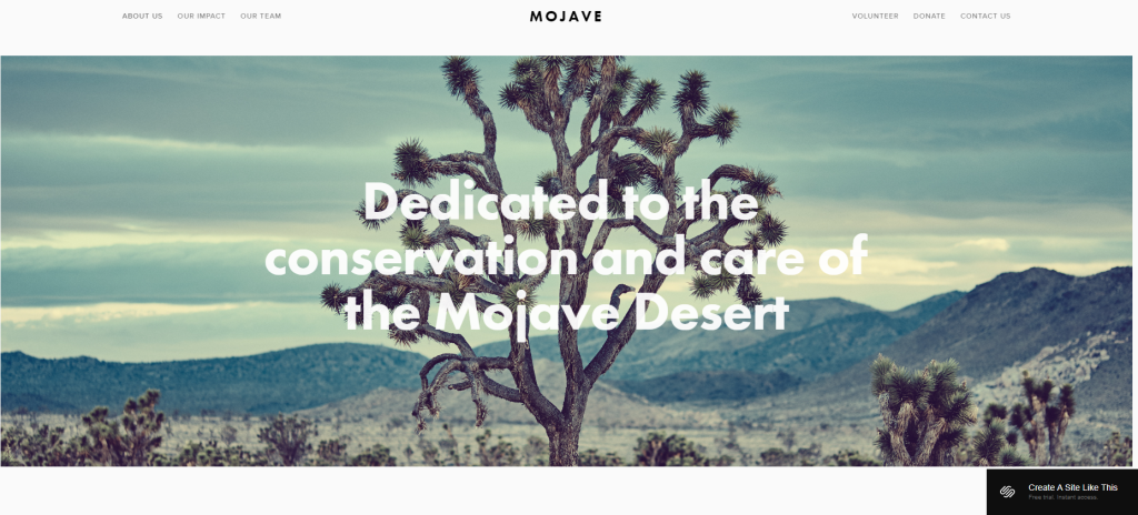
You could also include verses from the Bible that have a significant meaning for your community, as well as motivational quotes from members of your community or your pastor.
You can also collect donations and recruit volunteers with the assistance of a section labeled “call-to-action” (CTA) and buttons located in the navigation bar.
We also have beautiful About Us and Our Impact pages that allow you to share more meaningful content with both information and images.
These pages give you the opportunity to share your content. There is also a prominent page labeled “Contact Us,” which includes both a contact form and a map, making it simple for first-time visitors to get in touch with the company.
5. Patil – Traditional and Stylish
This template exudes an air of respectability and antiquity thanks to the design elements that Patil crafted.
The block of text that is located at the top of the page is an excellent location to highlight what it is about your church that sets it apart from others or to quote a verse from the Bible.
It is intended to operate as an online shop, but the Store page can very easily be modified to include links to events and other opportunities hosted by your church.

This functionality is not currently supported. One of my favorite aspects of this website is the attractive Call to Action (CTA) section that is located on the homepage.
This section gives you the opportunity to invite site visitors to learn more about your church.
6. Harbor – Use Your Photos To Tell Your Story
This image-heavy template comes from the Events category and is called Harbor. It has a large header and a photo that fills the entire screen to get things started.
The name and location of your church are all you need to include; alternatively, you can include the date of any celebrations or holidays coming up.

The remainder of the page is formatted with two columns, each containing titles and brief paragraphs, in which you can list all of the pertinent information regarding your church.
The Workshops and Events section showcases events, such as your services, community events, and Bible study times, using an ingenious combination of photos and overlaid text.
In addition to that, the theme offers pages for a Gallery and a Blog, as well as a sizable map, an RSVP button for scheduled events, and so on.
7. Paloma – Archive and Share Your Sermons
You can provide links to your most recent sermons conveniently located on the homepage of Paloma.
If you want to use your website to share the sermons and messages that are given at your church, the blogging and podcasting template known as Paloma could be ideal for you.
A link to each complete sermon, along with its date, an image, and a preview snippet, can be found in the Most Recent Episodes section of the homepage.
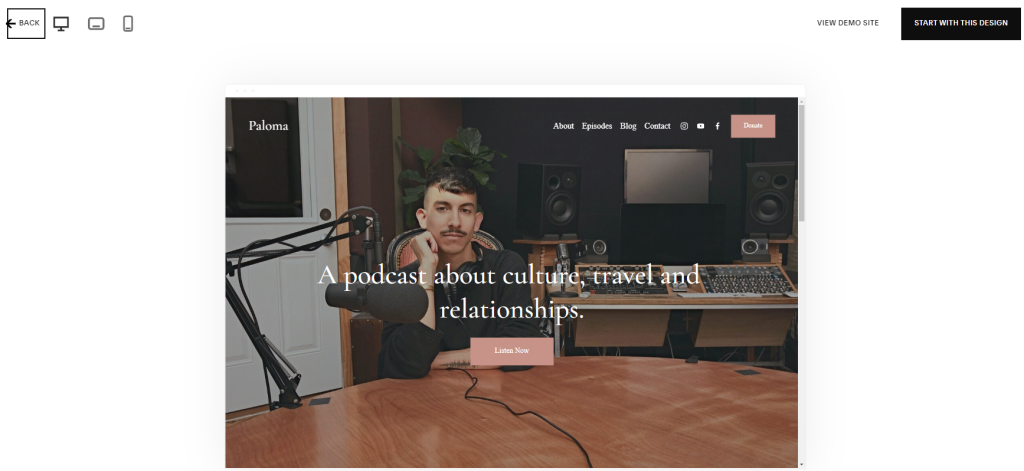
In addition, Paloma maintains a blog, which allows you to keep your community informed regarding events taking place at the church.
On the other hand, the About page gives you the opportunity to introduce both your church and its pastoral staff in a single location.
8. Barbosa – Sleek and Modern
In Barbosa, both the text and the images are large.
Like Lusaka, the modern Barbosa template was developed specifically for hotels and allows you to link to the most important pages on your site directly from the homepage.
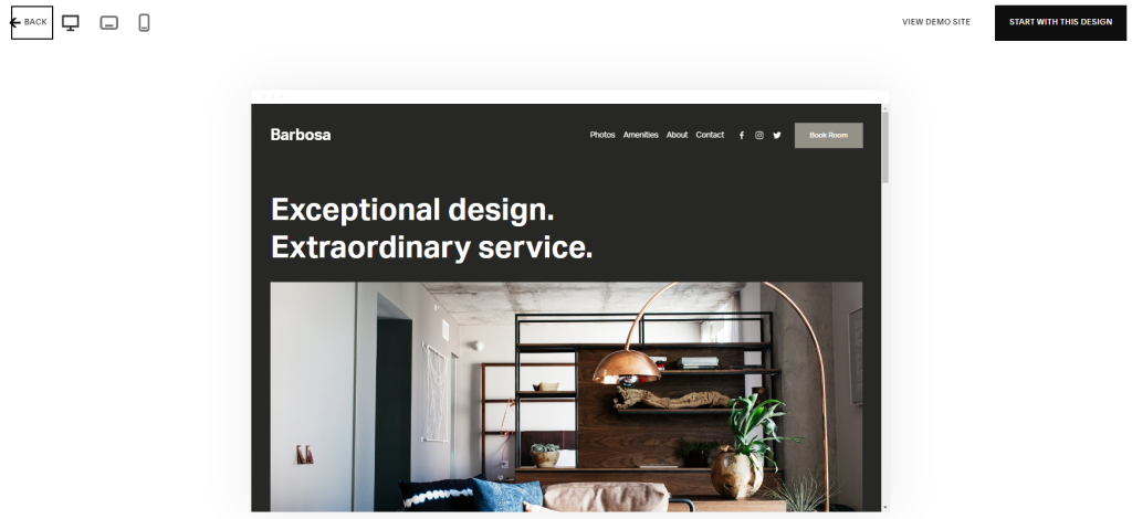
You can, for instance, provide visitors with a virtual tour of your place of worship, share information about your groups and gatherings, and provide prospective congregants with comprehensive information about your congregation.
Just above the area where you can highlight the name of your church or denomination, the header image includes a tagline in a bold font.
A signup form for a church newsletter could replace the CTA button, which is currently located in the top-right navigation menu.
Quick Links:
- 12 Best Funeral Websites: Templates And Themes
- 10 Best Carrd Templates: [Free & Premium]
- 10 Best Drag-And-Drop Website Builder
- 12 Best Photography Website Builder
Conclusion: Best Squarespace Templates For Churches 2026
It is not necessary for the website of your church to be overly complicated; rather, it should focus on providing visitors with the most essential information regarding your community and upcoming events.
The Squarespace templates that are listed here are ones that I recommend using, regardless of whether you want to simply share the essentials or conduct a more comprehensive outreach campaign.
