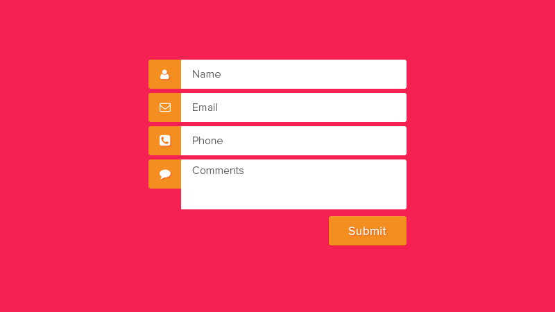
The Contact Us page is one of the most important pages to have on a website. Needless to say, it plays a vital role in allowing bloggers, visitors, press, even advertisers to get in touch. For a business owner, having a contact page helps to connect with visitors and have potential customers for business benefits. In short, there can be two reasons for including a contact page on the website.

The Contact Page is a Mandatory Requirement Because:
People can contact by means of an email, physical mail, or call the company over telephone.
Since majority use mobile phones these days with internet facilities, it is easy to grab phone numbers enlisted on a website and store the numbers in contacts making it hassle free to reach a company whenever needed. Contact page might be the shortest page on a website, but there’s no doubt about its significance. On its own potential, it could be the most significant page on a site. Even if the contact page can be located easily, it must be ensured that readers aren’t put off due to some common or silly mistakes.
7 Common Contact Page Mistakes and the Solutions:
Not Possessing a Contact Page:
It may sound very surprising but some website owners prefer to bury all the contact information, in a corner, at the bottom of homepage or on any sidebar. And, that’s the worst idea. How to avoid this mistake: First of all, there should be a completely separate contact page, ensuring that the page is visible on the navigation menu.
Lack of Necessary Contact Information:
It is futile to have a contact page which lacks the basic essential information. One can stick to a mere contact form, but all readers do not find it feasible to get in touch through these forms. How to fix the issue: To be approachable, the email address has to be included. In fact, it is wise to include as many contact details as is possible.
To Have a Contact Form That is Broken
Forms may work at times but not always. Even those forms which are designed by experts, with dropdown menus, several options may also break due to any update that had been installed or due to an error in code. Even more frustrating is when error messages aren’t even displayed, and when people are unsure as to whether the message has even gone through. Easy fix: Thus it’s compulsory to Test forms at a regular basis.
Not Linking Social Accounts
Irrespective of one’s avid social presence, a contact page isn’t the great way of showcasing it. There’s no need of linking any of the social accounts to the contact page. It’s necessary to ensure that the fancy social buttons on the sidebar doesn’t portray a poor image as everyone may not be attentive too. Quick fix: Link the social profiles that are most active on the contact page.
SEE ALSO: The Five Biggest Mistakes That Bloggers Make »
Outdated Information
Outdated information highlights nothing but negligence and carelessness. How to fix this problem: By making it a point to check and clear out any outdated information every month while testing the contact forms specifically will help.
Tips on What to Include on a Contact Page
Apart from the solutions to the problems provided, on the contact page, it has been noticed that some businesses include the basics like name of the company, address, email address, and telephone number(s) while others include a form for their visitors to fill the requested information.
A Compact and Simple Contact Page Ensures Success
In conclusion, it’s of utmost importance to have a Contact page for visitors and make it prominent and visible so that visitors do not have a difficulty in locating the Contact page. The Contact Us pages may include the basics or the contact form but must not include advertising in any form.